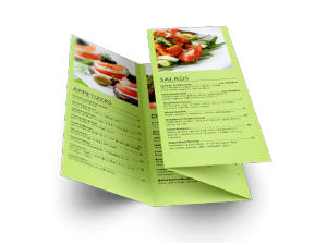
When you’re a small business starting out one of the most economical ways to get people to notice your business is to produce a flyer and distribute it in the neighborhood nearby. Sure, this may sound a bit old-fashioned but one of the reasons why you still get flyers in your mailbox is because they work. Certain business flyers will work better than others of course, but that usually just depends on how well designed they are. Here are some tips for designing and distributing effective custom flyers for your small business.
1. Use Color
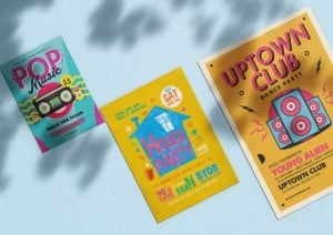
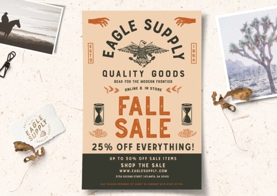
Color your world. It almost goes without saying, but color flyers are the way to go because without color, your flyer will easily get lost in other promotional material and if seen at all, might be considered “cheap-looking” to your potential customers and give the wrong kind of first impression. In this digital age, there’s a lot of visual noise to compete with so you want to look professional, vibrant, and use your company’s logo and branding to present a professional image.
2. Include an Offer
The flyer should stick to one main special offer. Keep things simple with your offer and use little, if any paragraph structure at all. You don’t want people to have to read your flyer for too long to figure out what it’s all about. Remember, they will probably be ruffling through other materials at the same time.
3. Have a Clear Call-To-Action
Present a call-to-action in your custom flyer. Don’t be shy about this. Tell your potential customer to come into your store, or phone the store to take advantage of the offer. If you’re doing flyer printing, then be sure to check that the flyer is telling the reader what to do. Your major objective here is presenting your potential client with a yes or no answer. Ambiguity is a killer of conversions, so you want to choose a language that negates that as much as possible.
4. Use Imagery
Do not use an image or photo at the top of the flyer. The top 20% to 25% of your flyer should be a bold headline that leads into information about your offer. For example, a local dog grooming business might put out a flyer with the headline “Bring your dog in this Saturday for our outdoor dog shampoo charity party”. Then you can divide the lower two thirds of the flyer into pictures that would probably include a dog getting a shampoo, a picture of your storefront (and perhaps one of the owners), and then some details about when the event is taking place and what charity to raise money for. You should also have a footer at the bottom of your business flyer with address and phone number details.
5. If You Have a Logo, Include It
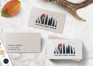
Always try and use your logo in printed material. This can be in one of the corners, overlaid on top of one of the pictures, or integrated into one of the border areas that includes highlighted information. Also try and choose complementary colors of your logo and/or store front and theme. If you have a website you should also consider that theme as well and provide a website address in the flyer.
Fortunately, PGprint offers flyer printing so that when you do decide to do a promotion, you will have full color flyers delivered to your door fast and for much less than a local printing company.


