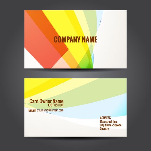
In a great business card design, the right font choices can’t be overstated. When you consider each of your business cards as a potential chance to make a connection with a future client or customer, it’s easy to see why the design of your business card is so important. And not just when it comes to logos and branding… but with your choice of fonts, as well.
While we can’t understate the value of an amazing logo, it’s your font choice that will really drive home your message.
Let’s discuss some of the choices you have to make your business card (or any marketing material) appear clean, easy to read, and stylish.
Sans Serif Fonts
San serif fonts include styles such as Arial, Helvetica, and Myriad Pro. These are a favorite font among designers because they’re clean, respected, and can serve any business—from a design or tech startup to a law firm or government entity. Using these clean fonts conveys that you’re modern, trendy, up-to-date and efficient. With a wide range of styles and characters, there are more weights for you to combine to make the perfect design.
Unique Handwriting or Calligraphic Scripts
There’s something about a touch of whimsy with a font that mimics handwriting or calligraphy that sends a sense of warmth. It’s an almost inviting way to reach out to potential clients.
If you’re self-employed or just starting out in your business (depending on the field), using a font such as these can become part of your personal branding. If you have a strong and legible signature, we can digitize it to become part of your design. Otherwise, there are many script fonts available for use.

Vintage and Aged Fonts
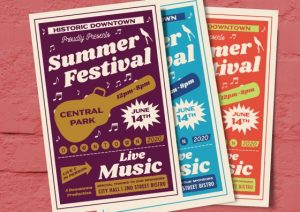
Looking to add a touch of vintage feel to your business cards? It’s become quite the trend in the past few years to incorporate an old-timey feel to a brand with antiquated looking fonts. The look of a worn type brings a classic vibe to your brand and works well for industries that have been around for a while. That old-fashioned look can make customers feel they’re doing business with someone established.
Use classic fonts like Clarendon or Rockwell to achieve this modern-yet-classic feel. And keep in mind what paper you’d like to use as well. Kraft paper will complement the fonts and be far more attention-grabbing than a plain white paper would. Step it up with a letterpressed card for an artisanal feel.
Cute and Fun Fonts
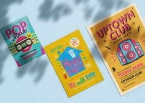
Who says businesses must be so… businesslike? You can have fun with your fonts and build a brand with them as well by using fun and quirky fonts. If your business is one aimed at children, pets, amusement, or recreation, then a more classic fonts like the sans-serifs mentioned before can take the fun out of the message you’re trying to convey to potential customers.
Fun fonts can include ones such as Lobster or Avenir Rounded. The perfectly crafted card can be playful and fun as well as serious.
Why Fonts Matter
Careful font choices and meaningful branding will help make sure your business is always putting it’s best foot forward in the marketplace. Whether you’re looking to rebrand an existing business or you’re a small business owner just starting out, you have a unique opportunity to create a card and brand that captures your personality and the business’s spirit.
Visit our site to upload your own design or ask about our custom design service and let us help you build the business you’ve always dreamed of!


