Have you ever walked into a storefront or service business with nothing on the walls but a clock?
Instead, compare that to being greeted by a visual treat that immediately grabs your attention, then tells you about the business, and the services offered. One conveys effort and professionalism while the other does not. Custom poster printing will help accomplish all these positive traits.
It doesn’t require much to create custom posters. To design posters is not rocket science. But keep in mind that they should attract attention, get across a message, and have a positive effect on the viewer.
Below are design tips to create enticing custom posters
1) Go big
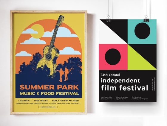
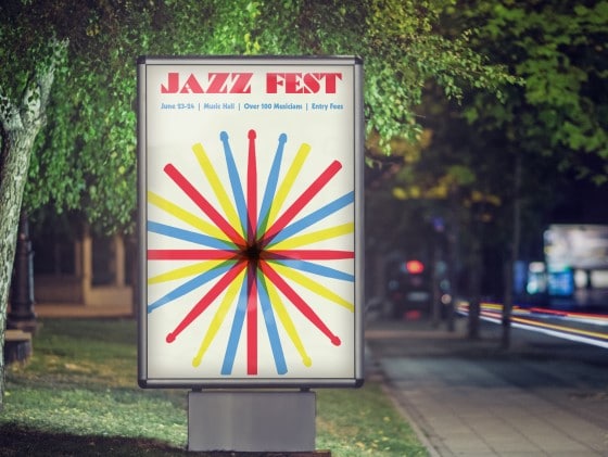
The graphics that make up a poster should fill it up – big elements are the key to really getting attention. This includes the text, which should be easily readable from a distance (someone walking by the store window shouldn’t have to squint), while at the same time communicating your intended message.
Think of the poster as a canvas that needs to be filled – you don’t want a lot of dead or unused space. Make sure that your images and text are scaled up proportionately to the desired size.
2) Keep it simple and deliberate
Keep it simple. The viewer should not be overwhelmed with distracting words or a choice of images that do not get the basic message across. The text should be kept to a minimum and placed in a readable part of the layout, and images should have a forceful presence that grabs the eye.
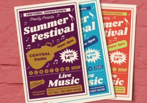
The colors used in poster printing should not be arbitrary but should be considered along with the eventual setting. If it will be on a wall that is a muted color, your poster should display contrasting color so that it stands out. You don’t need to go overboard with garish unaesthetic colors, but you don’t want to blend in like a chameleon either. You also want to consider the impact of various colors on your customers. There is a wealth of marketing information available that can help you choose just the right color for your message.
3) Stand out
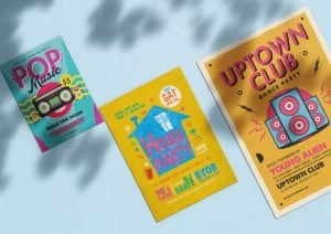
Another aspect when designing your poster is to really stand out from the pack. Choose an image that has characteristics that are sensational, shocking, stimulating, or just plain different somehow. We are not talking about risque images here, but there are ways to attract attention without being distasteful or displeasing. Humor, putting disparate images together, visual puns, ambiguous images, all can be used to set your poster apart from the crowd and bring in the customers.
4) Have a clear message
Finally, a good design ensures that the message of your poster is clear. Do you want the viewer to come inside, to go to another location, to make note of a website, a phone number or an address? Is a price or a sale offer the main point?
Be aware that separate parts of the design all add up to a whole that explicitly and clearly states your message. If the poster does that, then the design is effective and will give you exactly what you envisioned.
